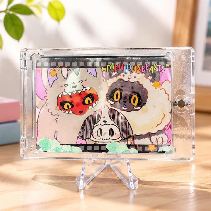
Landscape Editions
Character Duo Landscape Card
A wide character composition with contrasting figures and playful framing, suited to artwork where the relationship between characters is central to the design.
View productLandscape Editions
A portrait illustration card with a pink rectangular frame and a smaller central artwork panel, leaving a light outer area for decorative and collection details.
Best starting point
Share the artwork and intended presentation.
Useful project context
Include size, quantity and target timing.
Product story
The pink frame illustration card uses a portrait layout with a smaller rectangular artwork panel inside a broader pink surround. The outer area carries light decoration and collection identity, while the central illustration has its own clear boundary. This gives the design a different balance from a full-bleed character card: the surrounding space is an intentional part of the composition.
For a custom version, prepare the illustration crop and outer frame independently. The center should retain the important face, pose and costume detail without being enlarged until it fills the whole card. Small decorative wording and thin rules in the surround need their own readability check at the proposed finished size.
A selected frame accent can be discussed separately from the central print. Fine foil lines, UV areas or a quieter laminated surface should be reviewed against the actual artwork rather than added as a standard package. The central panel and light outer area may need different levels of visual emphasis; compare that balance before approving the finish mask.
Send the portrait illustration, rectangular crop, frame artwork and final wording. Include reverse-side content and any additional designs using the same pink surround. Identify the intended quantity and whether the cards will be handled individually, stored in an album or presented in protective holders, with accessories confirmed separately.
A consistent frame helps individual designs read as one collection.
The finish direction can support the illustration without taking over.
The visual system can extend across additional card designs.
Product video
Review the surface, visual movement and overall presentation before sharing your project brief.
Discuss This ProductArtwork readiness
Buyer questions
Use a separate finish mask and flag very fine lines or small text for review.
Combinations are possible, but artwork, registration and surface interaction should be reviewed together.
Include artwork, dimensions, quantity, intended use and visual references.
Landscape Editions
A wide character composition with contrasting figures and playful framing, suited to artwork where the relationship between characters is central to the design.
View product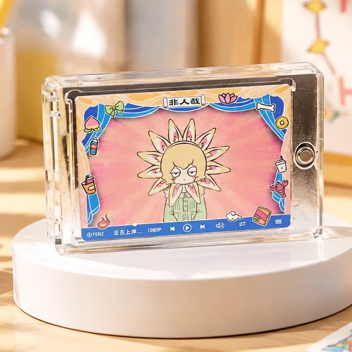
Landscape Editions
A landscape card with a strong central emblem, vivid background and decorative outer frame, using symmetry and contrast to organize an energetic illustration.
View product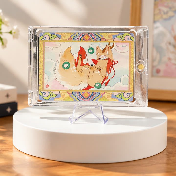
Landscape Editions
A landscape illustration card with a light central scene and a colorful decorative surround, for projects that need space for several illustrated details.
View productWorking pathway
Clear communication keeps artwork, finishing and production decisions aligned.
Share artwork, format, quantity and visual references.
Align material, structure and finish priorities.
Review appearance, registration and handling where needed.
Confirm the approved direction before production.
Send your artwork, dimensions, quantity and visual references for a focused conversation.