Landscape Editions
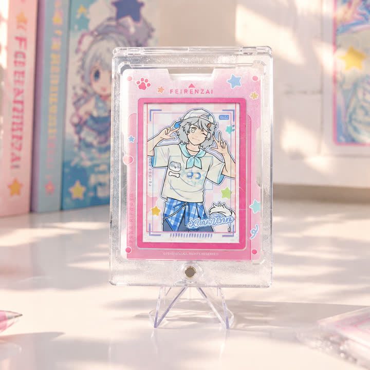
Pink Frame Illustration Card
A portrait illustration card with a pink rectangular frame and a smaller central artwork panel, leaving a light outer area for decorative and collection details.
View productLandscape Editions
A wide character composition with contrasting figures and playful framing, suited to artwork where the relationship between characters is central to the design.
Best starting point
Share the artwork and intended presentation.
Useful project context
Include size, quantity and target timing.
Product story
The character duo landscape card gives contrasting figures room to share the same horizontal composition. Dark and lighter character shapes create a clear visual relationship, while the surrounding playful graphics connect the design. The format is relevant when a card needs to show interaction between subjects rather than isolate one figure inside a portrait frame.
A custom layout should be checked for the relative scale and spacing of the characters. Cropping one figure too tightly or placing another against a busy motif can weaken the relationship. Keep facial detail, accessories and collection lettering independent so the composition can be adjusted without flattening everything into one background layer.
Selective surface emphasis can be discussed for a title, outline or surrounding decoration. The effect should not make one character disappear while another remains visible. If UV or a reflective accent is proposed, review the mask against both figures and compare their contrast under changing light. Material and finish choices remain project decisions rather than assumptions based on the protective holder.
Send the layered character artwork, background elements, final lettering and intended quantity. Include the reverse design and explain whether the artwork is a standalone duo, one entry in a relationship-based series or part of a wider character range. Identify any required holder, stand or set packing separately.
A consistent frame helps individual designs read as one collection.
The finish direction can support the illustration without taking over.
The visual system can extend across additional card designs.
Product video
Review the surface, visual movement and overall presentation before sharing your project brief.
Discuss This ProductArtwork readiness
Buyer questions
Use a separate finish mask and flag very fine lines or small text for review.
Combinations are possible, but artwork, registration and surface interaction should be reviewed together.
Include artwork, dimensions, quantity, intended use and visual references.
Landscape Editions
A portrait illustration card with a pink rectangular frame and a smaller central artwork panel, leaving a light outer area for decorative and collection details.
View product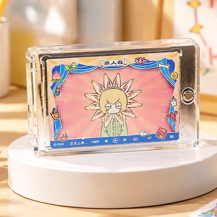
Landscape Editions
A landscape card with a strong central emblem, vivid background and decorative outer frame, using symmetry and contrast to organize an energetic illustration.
View product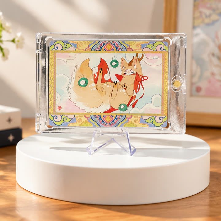
Landscape Editions
A landscape illustration card with a light central scene and a colorful decorative surround, for projects that need space for several illustrated details.
View productWorking pathway
Clear communication keeps artwork, finishing and production decisions aligned.
Share artwork, format, quantity and visual references.
Align material, structure and finish priorities.
Review appearance, registration and handling where needed.
Confirm the approved direction before production.
Send your artwork, dimensions, quantity and visual references for a focused conversation.