Buyer FAQ
Practical Answers for Better Card Decisions
Use these answers to prepare artwork, compare finish directions and build a clearer inquiry.
Topic 01
Materials and Surface Protection
When is a transparent card useful?
Use transparency when clear space and the background are part of the composition.
Matte or gloss?
Matte reduces glare and feels softer. Gloss increases shine and color intensity.
Topic 02
Foil and Holographic Effects
How should foil areas be prepared?
Separate foil from print artwork and flag fine lines or small text for review.
Can holographic effects cover the full card?
The coverage should follow the artwork and the contrast needed for readable detail.
Topic 03
UV and Surface Contrast
What does spot UV add?
Spot UV adds selective gloss to focal areas.
What changes with crystal or reverse UV?
Crystal UV adds raised texture, while reverse UV creates matte-to-gloss contrast.
Topic 04
Cuts, Windows and Layers
What needs attention around a window?
Keep openings away from fragile edges and define cut paths clearly.
Can several structures be combined?
They can, but thickness, alignment and handling should be reviewed together.
Artwork readiness
Prepare a More Useful Project Brief
- ✓Define finished size and bleed.
- ✓Separate print artwork from finish masks.
- ✓Mark cut, fold and window paths clearly.
- ✓Identify critical text and fine detail.
- ✓Share quantity and target timing.
- ✓Add a visual reference for the intended effect.
Product directions
Continue with a Product Direction
Start with the format and visual role, then refine material and finishing around the artwork.
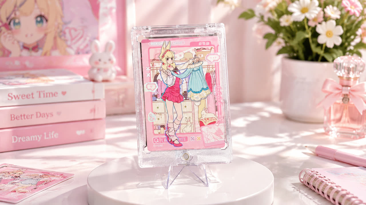
Character Collectibles
Portrait-led card directions for character, entertainment and creative merchandise.
View line →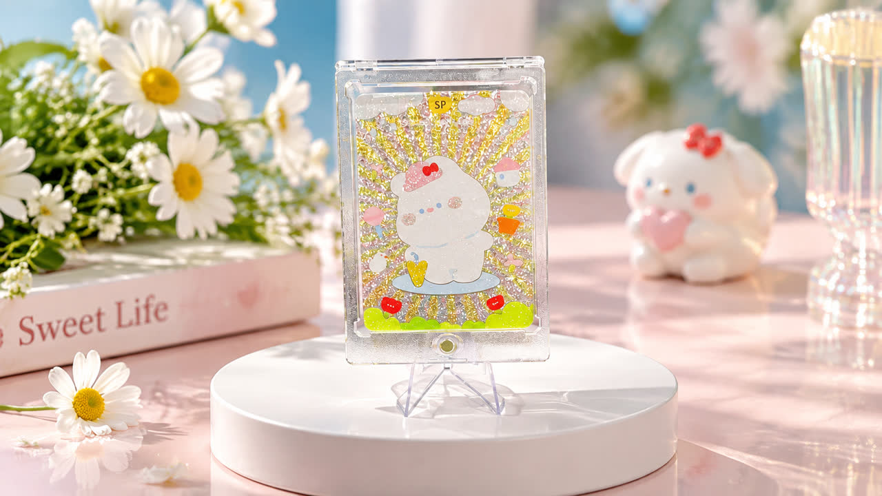
Display Cards
Card directions developed around clear presentation and display-oriented handling.
View line →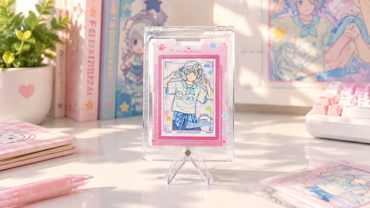
Landscape Editions
Horizontal formats that give wider scenes and paired compositions room to read.
View line →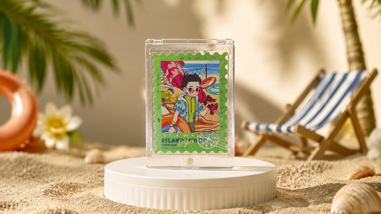
Seasonal Editions
Color-led card directions for seasonal, botanical and lifestyle collections.
View line →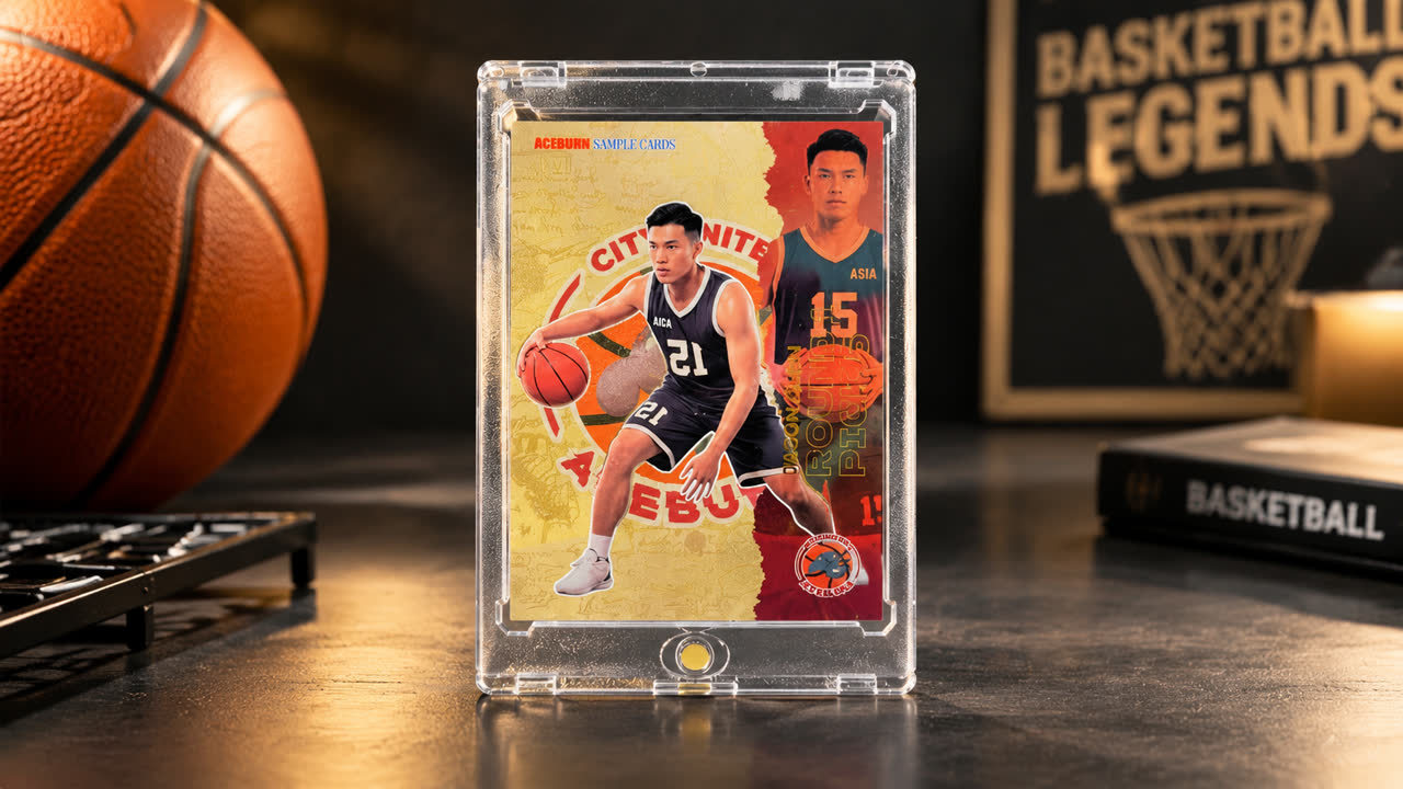
Sports Collectibles
Multi-design card series for sports-led collections and display programs.
View line →Ready to shape the right card for your project?
Send your artwork, dimensions, quantity and visual references for a focused conversation.