Seasonal Editions
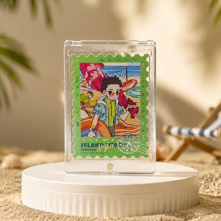
Tropical Illustration Card
A tropical portrait card with a bright character scene, decorative green border and a dedicated caption area, designed around lively artwork rather than a plain portrait.
View productSeasonal Editions
A summer-themed portrait card with large headline lettering, playful character artwork and beach-inspired color, suited to a seasonal merchandise collection.
Best starting point
Share the artwork and intended presentation.
Useful project context
Include size, quantity and target timing.
Product story
The summer collectible card brings a holiday theme into a compact portrait format. Large headline lettering sits above a playful central character, while bright surrounding graphics carry the beach mood. The design has more information than a simple portrait card, so hierarchy matters: the title, character and supporting decoration should not all compete at the same visual strength.
For a custom seasonal collection, decide which elements identify the campaign and which belong to individual card designs. A common headline position and consistent reverse can connect the release, while illustrations and color combinations vary. Keep small text editable and review its contrast against busy backgrounds instead of relying only on the large display lettering.
Finish options should reinforce the lively artwork without masking it. A holographic accent can be considered for selected background areas, and foil or UV may be discussed for a headline or focal detail. Each extra process needs its own artwork mask and sample review. Combining every available effect is not automatically a better match for a colorful design.
Send the seasonal artwork, headline text, planned release variants and quantities. Include the reverse-side design and explain whether the card is intended for a gift set, collectible series or individual retail presentation. Specify protective holders or other packing separately, and provide artwork you own or are authorized to reproduce.
A consistent frame helps individual designs read as one collection.
The finish direction can support the illustration without taking over.
The visual system can extend across additional card designs.
Product video
Review the surface, visual movement and overall presentation before sharing your project brief.
Discuss This ProductArtwork readiness
Buyer questions
Use a separate finish mask and flag very fine lines or small text for review.
Combinations are possible, but artwork, registration and surface interaction should be reviewed together.
Include artwork, dimensions, quantity, intended use and visual references.
Seasonal Editions
A tropical portrait card with a bright character scene, decorative green border and a dedicated caption area, designed around lively artwork rather than a plain portrait.
View product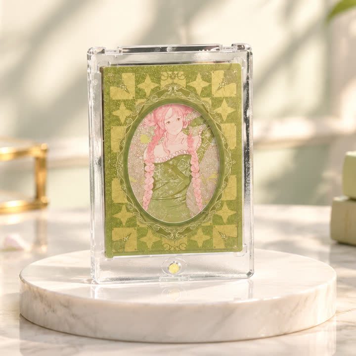
Seasonal Editions
A botanical portrait card with a green patterned surround and an oval illustration area, combining nature-led decoration with a clearly separated central image.
View productWorking pathway
Clear communication keeps artwork, finishing and production decisions aligned.
Share artwork, format, quantity and visual references.
Align material, structure and finish priorities.
Review appearance, registration and handling where needed.
Confirm the approved direction before production.
Send your artwork, dimensions, quantity and visual references for a focused conversation.