Character Collectibles
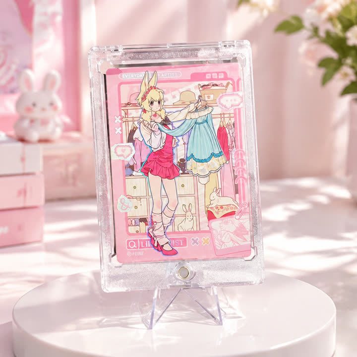
Pastel Character Collectible Card
A pastel character card with a larger central illustration and integrated pink border, balancing several soft-colored artwork elements within a portrait composition.
View productCharacter Collectibles
A light-toned character series with open portrait layouts and seasonal styling, intended for collections where the artwork stays clear rather than heavily framed.
Best starting point
Share the artwork and intended presentation.
Useful project context
Include size, quantity and target timing.
Product story
The winter character series takes a lighter approach to collectible-card presentation. Pale backgrounds, cool accents and open space around the portrait give the artwork room to read. Across the gallery, different character designs share a restrained seasonal mood without needing identical illustrations. This makes the series a useful starting point for a coordinated release built around several characters.
The important layout decision is how much background remains visible around each figure. Keep the portrait scale and identifying text consistent across the collection, then adjust decorative elements to suit the individual artwork. White or pale areas should be treated as deliberate parts of the design, not filled with effects simply because space is available.
A custom version can be reviewed with a quiet laminated surface, selected foil accents or a restrained UV mask. Those choices should be evaluated against the pale artwork: a reflective area may look different in daylight and under display lighting. The transparent protective holder in the presentation does not, by itself, identify the card substrate. Confirm material and thickness through the project brief rather than assuming a clear card.
For an inquiry, send every portrait design, the intended collection size and matching reverse layouts. Include the preferred visual balance between printed artwork and reflective detail. If the collection will be displayed in holders or kept in an album, provide that context before finalizing the finished format and any additional presentation items.
A consistent frame helps individual designs read as one collection.
The finish direction can support the illustration without taking over.
The visual system can extend across additional card designs.
Product video
Review the surface, visual movement and overall presentation before sharing your project brief.
Discuss This ProductArtwork readiness
Buyer questions
Use a separate finish mask and flag very fine lines or small text for review.
Combinations are possible, but artwork, registration and surface interaction should be reviewed together.
Include artwork, dimensions, quantity, intended use and visual references.
Character Collectibles
A pastel character card with a larger central illustration and integrated pink border, balancing several soft-colored artwork elements within a portrait composition.
View product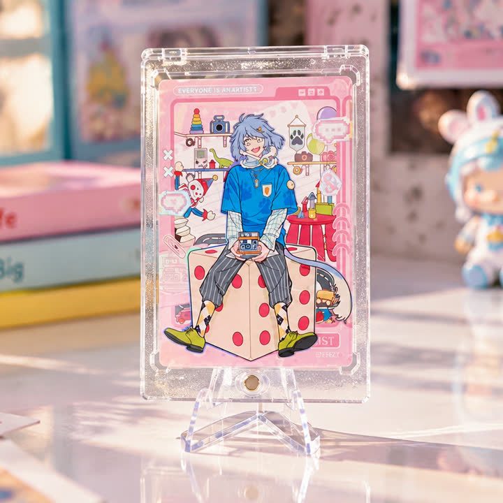
Character Collectibles
A portrait-format group character card with a prominent foreground figure, supporting portraits and small illustrated motifs, organized around a clear visual hierarchy.
View product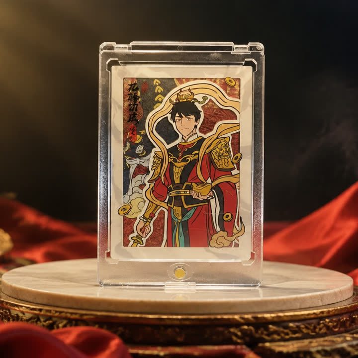
Character Collectibles
An ornamental portrait card with dark outlining, warm jewel-like colors and stained-glass-style illustration, combining a strong character silhouette with detailed decoration.
View productWorking pathway
Clear communication keeps artwork, finishing and production decisions aligned.
Share artwork, format, quantity and visual references.
Align material, structure and finish priorities.
Review appearance, registration and handling where needed.
Confirm the approved direction before production.
Send your artwork, dimensions, quantity and visual references for a focused conversation.