Character Collectibles
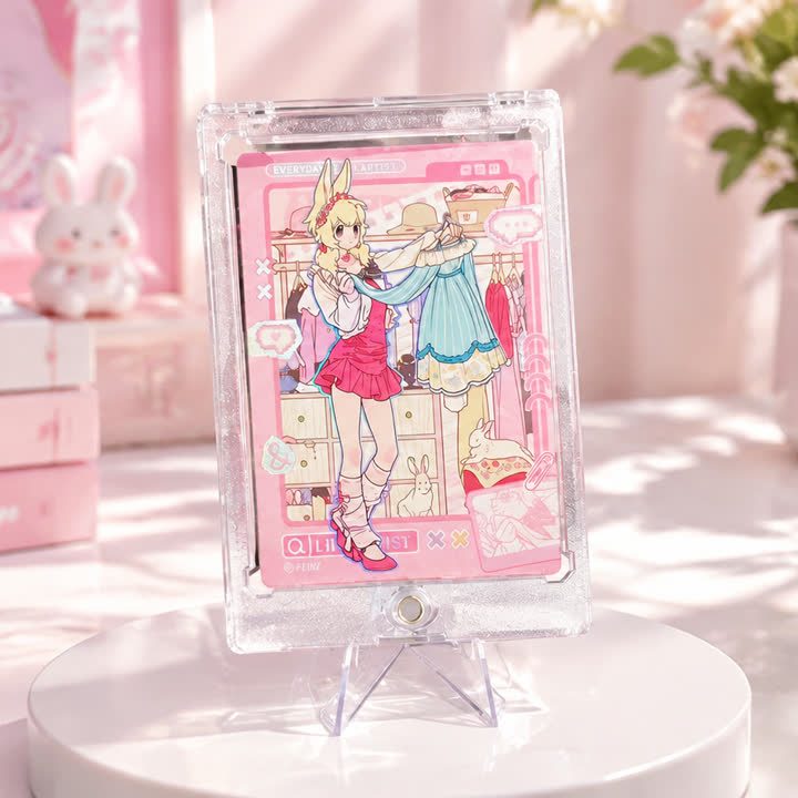
Pastel Character Collectible Card
A pastel character card with a larger central illustration and integrated pink border, balancing several soft-colored artwork elements within a portrait composition.
View productCharacter Collectibles
An ornamental portrait card with dark outlining, warm jewel-like colors and stained-glass-style illustration, combining a strong character silhouette with detailed decoration.
Best starting point
Share the artwork and intended presentation.
Useful project context
Include size, quantity and target timing.
Product story
The ornamental collectible card uses a stained-glass-style graphic treatment: dark outlines divide the character and surrounding decoration into clearly defined shapes. Warm colors and a strong portrait silhouette give the card a more formal appearance than a soft pastel design. The effect comes from the printed composition; the visual style does not identify the card as glass.
For custom artwork, preserve the dark contour layer separately from colored areas and small decorative elements. Fine intersections, narrow gaps and small lettering need review at the finished size. If the contour becomes too heavy after reduction, it can hide the lighter detail that makes the illustration distinctive.
Selected border or contour areas can be reviewed for foil or UV emphasis, but the mask should not simply repeat every dark line. Dense ornament increases the need for precise alignment between print and additional finishes. Compare the portrait, fine decoration and reflective areas together before approving the final artwork and production approach.
Send the layered illustration, ornament, final lettering and reverse design. Mark the details that need emphasis and those that should remain printed only. Include the intended format, quantity and whether the design will be a standalone presentation card or part of a coordinated ornamental collection. Define holders and gift packing separately.
A consistent frame helps individual designs read as one collection.
The finish direction can support the illustration without taking over.
The visual system can extend across additional card designs.
Product video
Review the surface, visual movement and overall presentation before sharing your project brief.
Discuss This ProductArtwork readiness
Buyer questions
Use a separate finish mask and flag very fine lines or small text for review.
Combinations are possible, but artwork, registration and surface interaction should be reviewed together.
Include artwork, dimensions, quantity, intended use and visual references.
Character Collectibles
A pastel character card with a larger central illustration and integrated pink border, balancing several soft-colored artwork elements within a portrait composition.
View product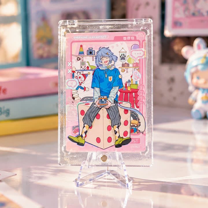
Character Collectibles
A portrait-format group character card with a prominent foreground figure, supporting portraits and small illustrated motifs, organized around a clear visual hierarchy.
View product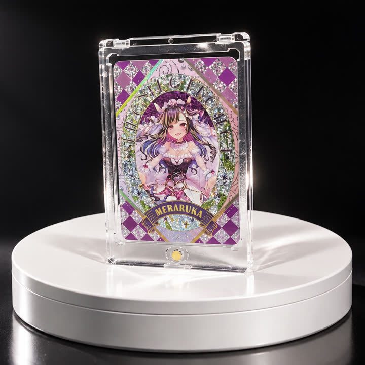
Character Collectibles
A purple character card with an oval portrait, diamond-pattern surround and layered decorative borders, giving the central illustration a clearly structured frame.
View productWorking pathway
Clear communication keeps artwork, finishing and production decisions aligned.
Share artwork, format, quantity and visual references.
Align material, structure and finish priorities.
Review appearance, registration and handling where needed.
Confirm the approved direction before production.
Send your artwork, dimensions, quantity and visual references for a focused conversation.